What Makes a Good Photograph:
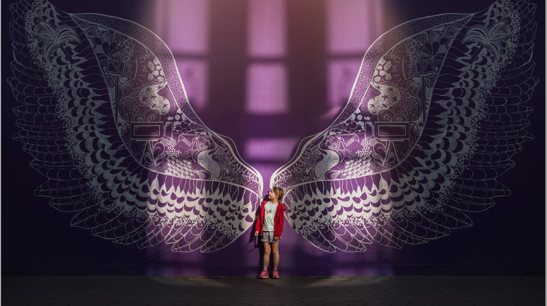
Photo by D’Ann Boal
https://www.smittenandswoon.com/
(I don’t have a direct link to this photo. It was shared in a workshop I took from D’Ann but I included her website.)
I chose this photo to discuss because I believe it has several traits of a good photo but also breaks some of the traditional rules (in a good way). I feel this photo has excellent composition including pleasing and bold colors and incredible light and patterns. The symmetry with both light and design allows this photo to look better centered than following the rule of thirds. I love how the light focuses on the subject in the middle of the photo and draws you in even more with the red jacket. The wings provide leading lines to the subject or a path for your eyes. The punchline is that the subject or child is even more impressed or awed by the giant wings than the viewer. Her gesture tells a story of how magical childhood is which also supports the rest of the image. I also think the photographer does an amazing job of filling the frame and using depth and size to make the image even more powerful.
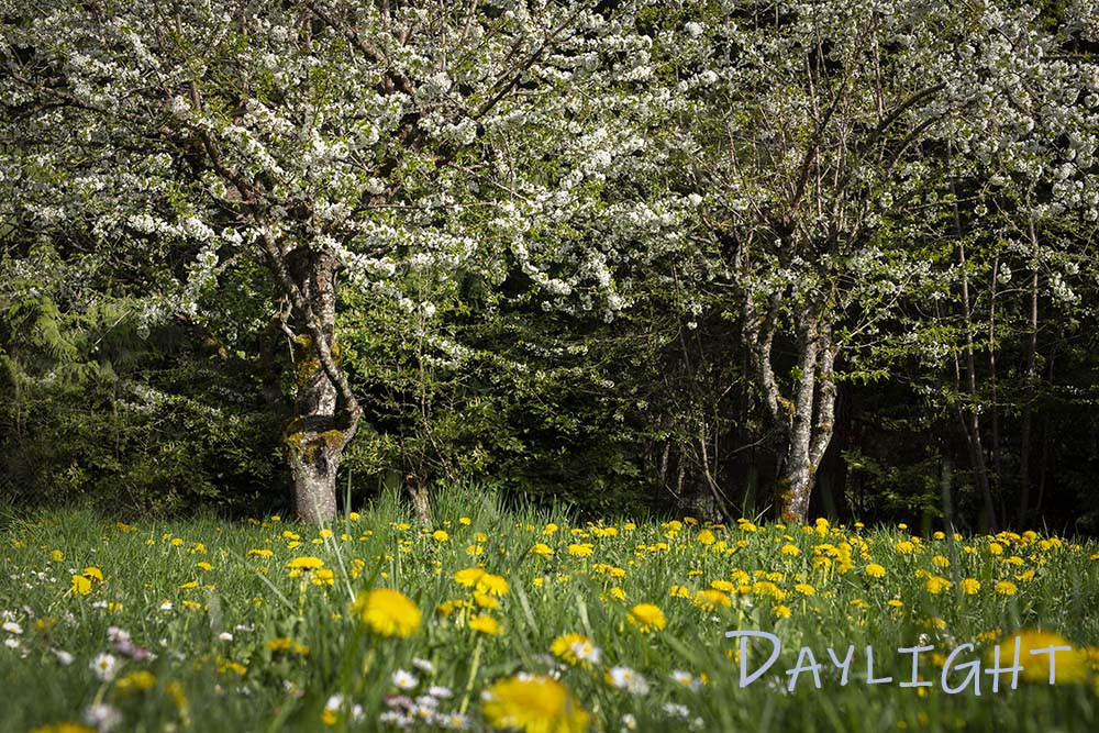
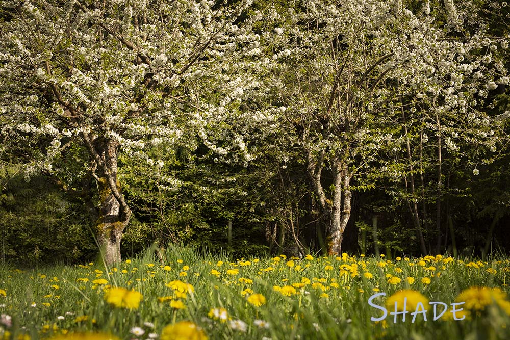
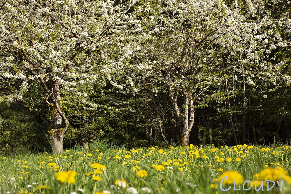
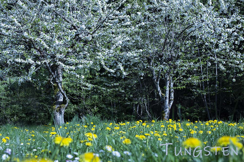
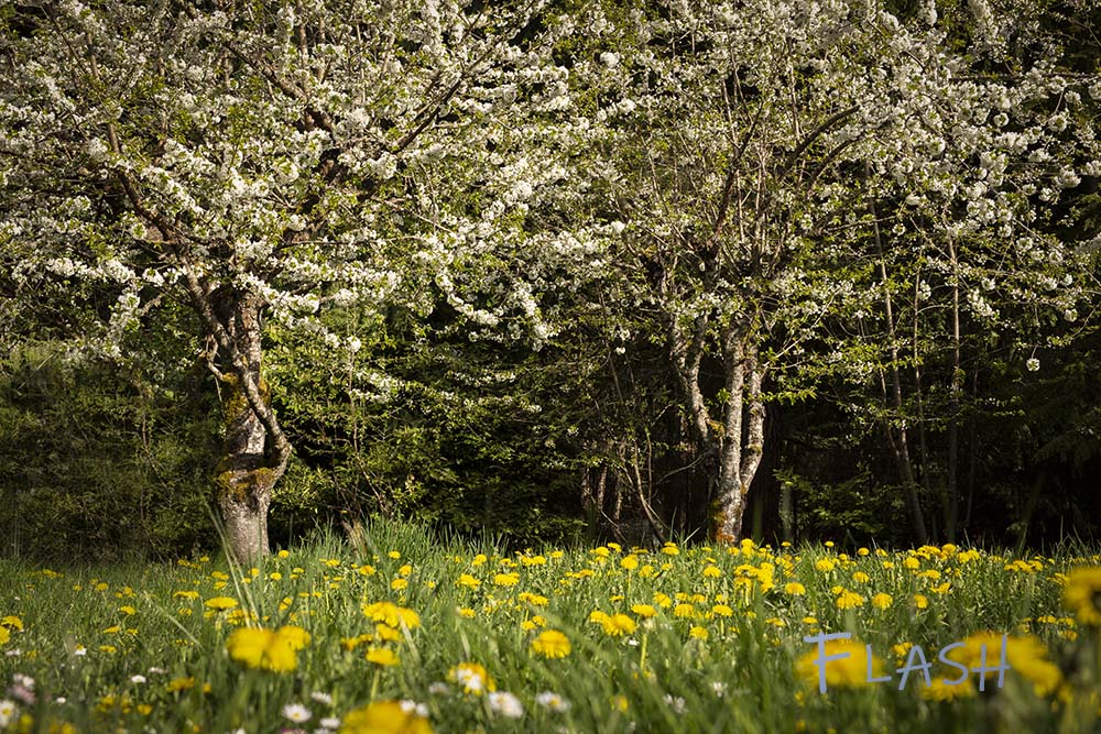
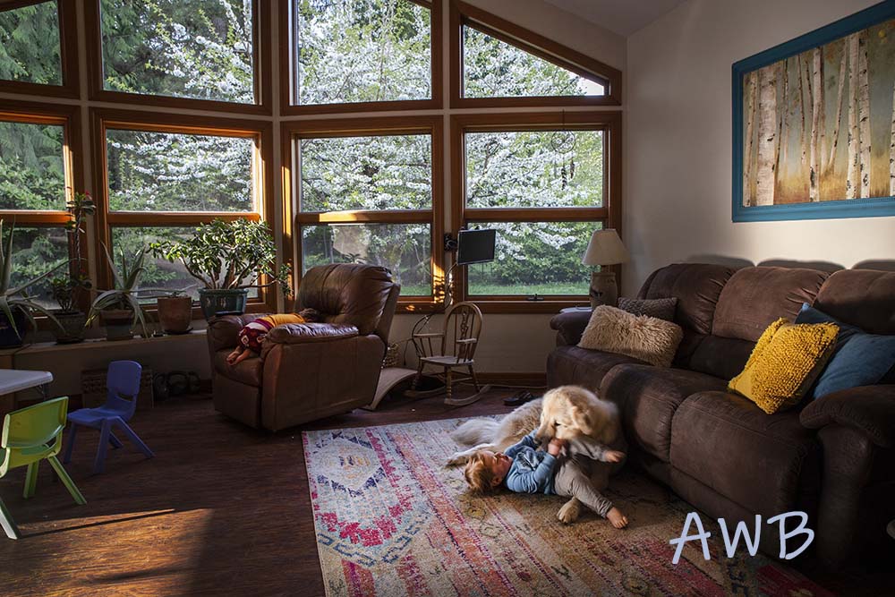
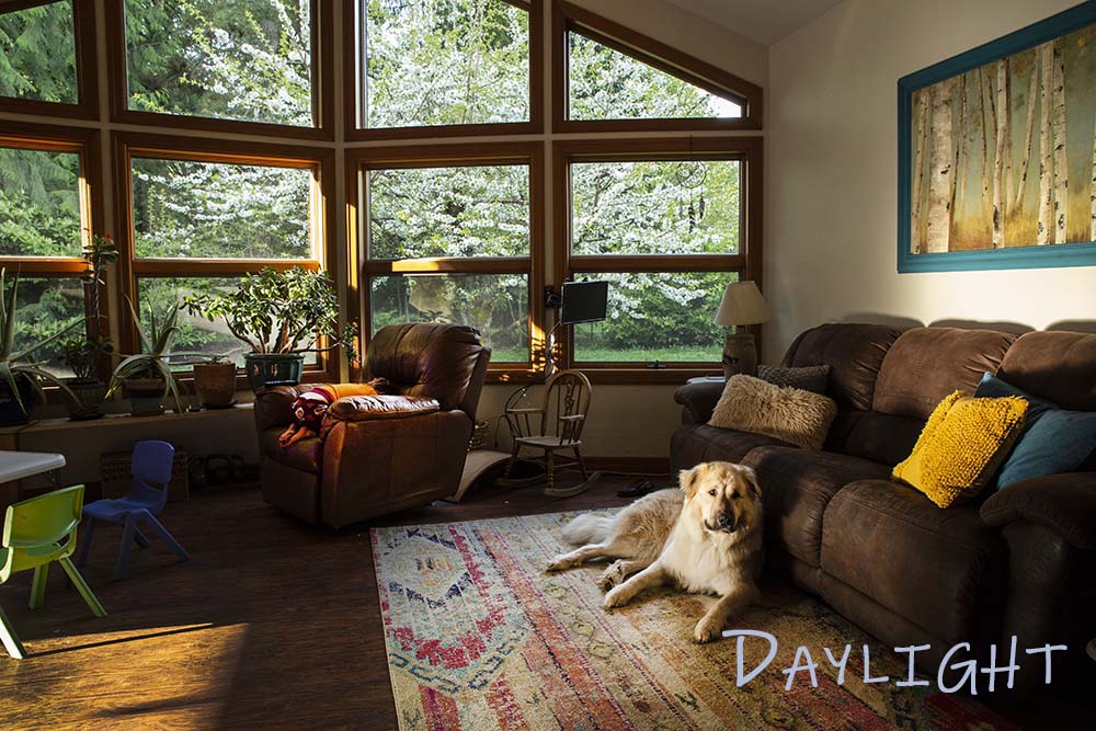
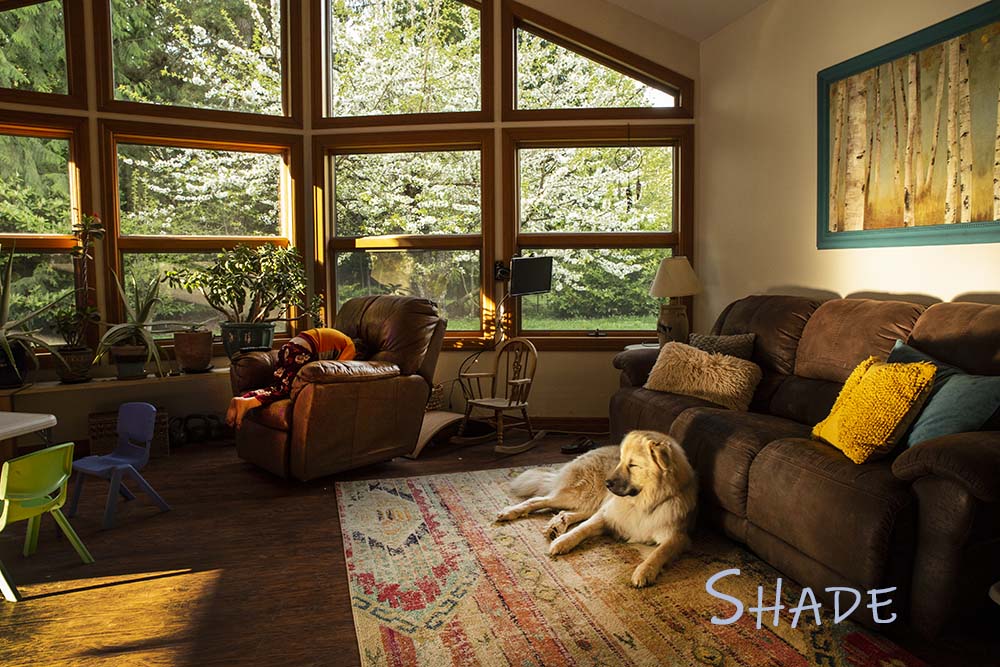
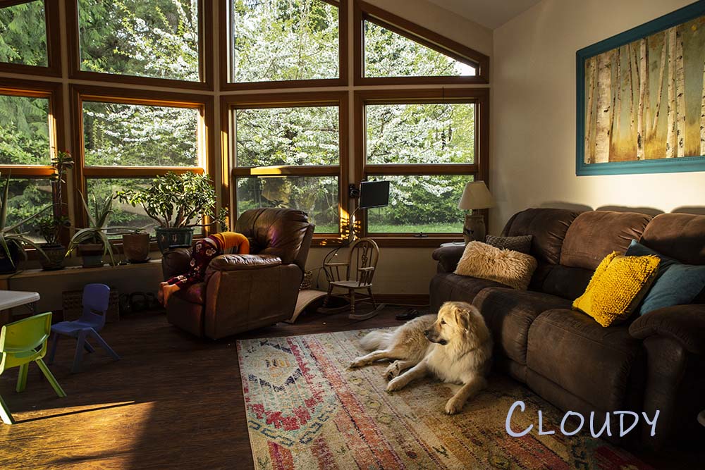
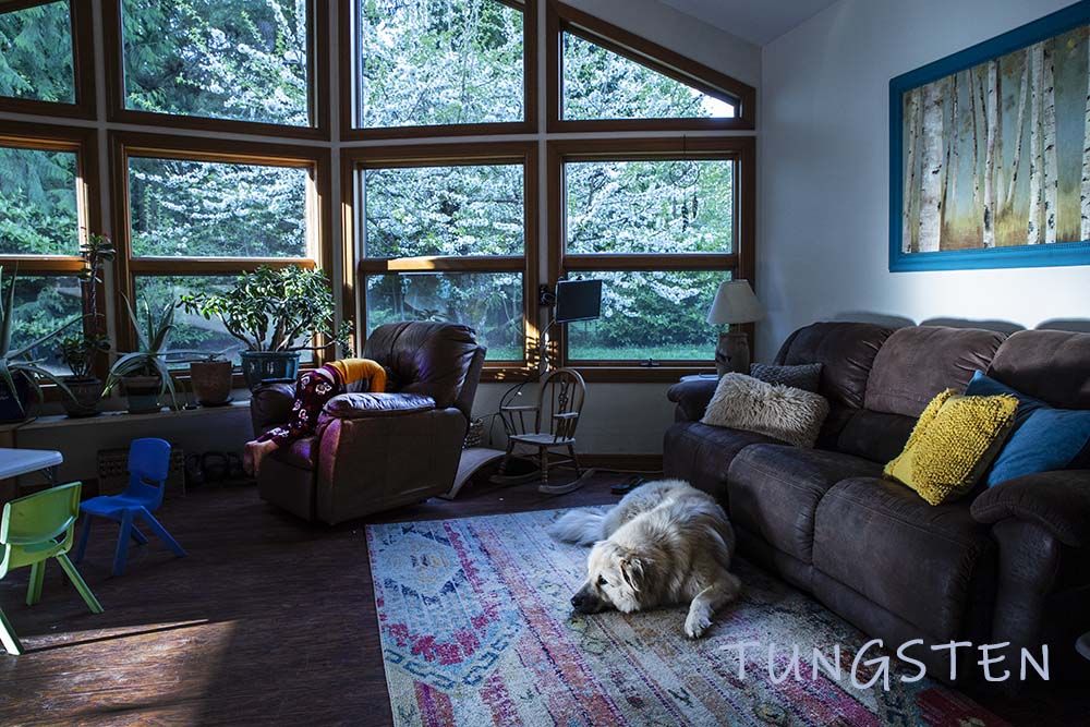
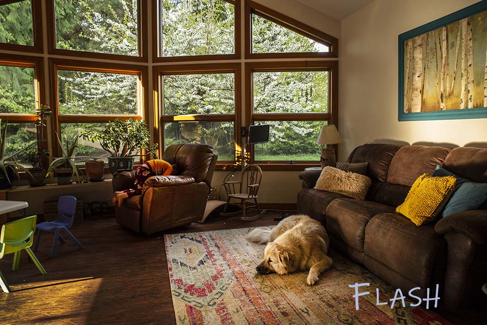
White Balance: Outdoor/ Indoor Assignment
Visual Literacy Assignment:
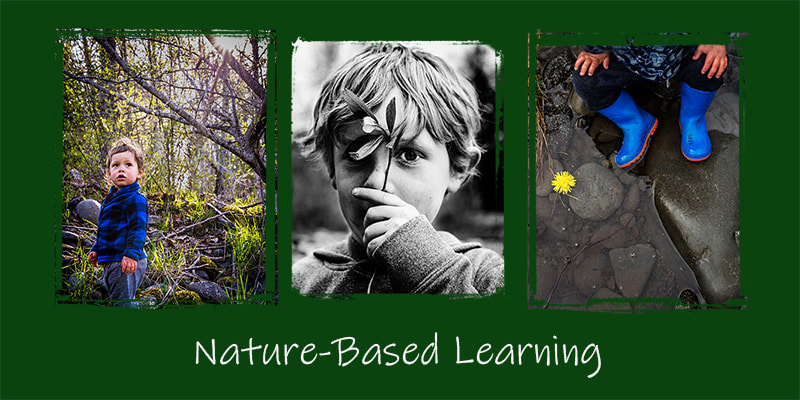
Photo Analysis:
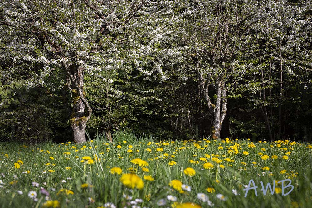
I’m focusing this photo analysis on the three visual literacy photos. My goal is to communicate the importance of nature in our lives, especially children. I used both color and monotone to add mood and draw attention to the natural elements. I also used image placement and color to add balance and connect the story. I think there is a major disconnect in the world between children and nature. Environmental and nature-based education has always been very important to me and 80 percent of what I shoot includes my kids outdoors in nature. In these photos, I emphasized the light in the forest and my son’s connection to the flower in the water to draw you into the meaning of nature learning. I used a shallow depth of field (f 3.2) with the bnw photo to pull your focus to my son’s eye and the tree branch. I used a deep depth of field (f 14) on the left photo to create the small starburst in the tree and to show off the forest around my son – hoping to again, emphasize the connection to nature. I used f 5.6 for the right photo to keep my son’s hands and boots in focus with the water. I did miss an opportunity to get the dandelion sharp but I think it is okay. I like the pop of color and the stillness of the water and river rocks. I think it provides nice contrast. All of the light used in the photos was natural outdoor light and these were taken early evening.
I think there is always room for improvement as I am a perfectionist and budding photographer. There are a couple of things that really stood out to me with the photos that I’d like to change. I struggled with the tree/starburst (left) photo in the digital literacy assignment as I didn’t think it “matched” the other two photos in tones. It is a lot brighter even after pulling down the blacks and highlights to align it with the other photos. I also think the photo is busy and less exciting than the other two. It doesn’t look as sharp especially when I downsized for web. However, it still conveys the message so I included it. Another thing I would change is the deep shadows on my son’s face in the bnw shot. There is a lot of grain on the left side of his face and I had to lighten it up quite a bit in PS. This photo was taken quickly (as most are with my always-moving 2 and 4-year-olds) but if planned, I would have moved him a little into the light to remove some of the shadows. Most of the time I don’t stage the photos of my kids and I am often taking photos on the fly. I like to catch them in their natural element and prefer the documentary/lifestyle type of photography. For this reason, I think my photos are more raw and flawed. I am okay with hair in the eyes or sticking straight up, dirt on the face, scratches and bruises… it reminds me of how wild my boys are (just like nature).
